
Congratulations on deciding to launch your newsletter! It’s an exciting opportunity to stay connected with your audience and show them how your business can help. However, creating a newsletter layout that is visually appealing is just as important as the content itself.
Your readers don’t want to wade through a newsletter that looks like it was copied and pasted from Word. A cluttered or unpolished design can discourage engagement.
Since your newsletter is a direct reflection of your brand, it’s crucial to make it look professional, simple, and engaging.
To help you design something your audience will love, here’s a step-by-step guide to keeping your newsletter layout clean and clear.
Start With A Template
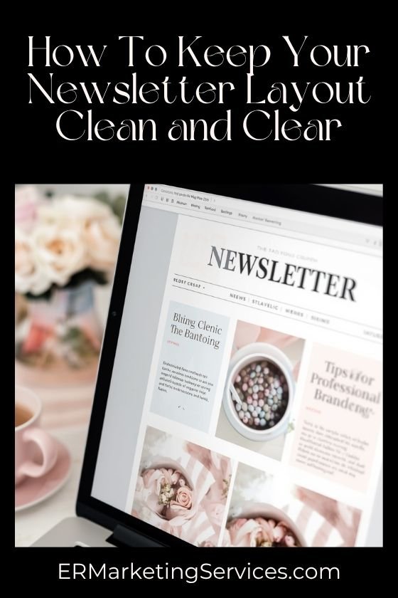
The easiest way to create a clean newsletter layout is to start with the right template. Templates save time and ensure your design remains consistent and professional.
If you have advanced graphic design skills and access to tools like Adobe InDesign, you can create one from scratch. For most people, though, free tools like Canva are excellent options. Canva offers a wide variety of templates that are perfect for newsletters, and they’re highly customizable.
When browsing templates, look beyond colours and fonts at this stage. Focus more on the structure and layout that best aligns with your brand’s identity.
Does it allow space for visuals?
Does it include clearly defined areas for text?
Once you’ve chosen a template, you’re ready for the next step: personalization.
Make The Template Your Own
Now that you have a template, it’s time to make it uniquely yours. This is where your branding elements come into play.
Start by incorporating your brand’s colour palette, fonts, and logo. These details help reinforce your business identity while maintaining a cohesive look.
Use bold colours sparingly to make headers or call-to-action buttons stand out, while keeping softer shades for backgrounds. Too much contrast can make your design overwhelming or messy.
Another important tip is to keep things consistent. If you’ve used a specific header font in the past, stick with it for your newsletter. Consistency builds trust and makes your newsletter layout look polished.
Finally, remember the golden rule: less is more. Avoid overloading your layout with too many visual elements.
A simplified, cohesive design will always win.
Don’t Overload With Pictures
It can be tempting to load your newsletter with pictures, but less is more when it comes to visuals. Your readers are primarily here for your content, so only include images if they add value or guide the reader’s eye.
At the very least, use one eye-catching header image. This sets the tone and grabs attention immediately. Beyond that, only include images if they are highly relevant to the content. A photo unrelated to your topic (like your adorable new puppy) will only distract your readers.
If you decide to include additional images, place them intentionally. Let them guide your readers through your newsletter layout. For example, you might add an image between paragraphs to break up text visually or include a product shot next to a special offer.
Space Out Your Text Sections
No one likes being overwhelmed by a solid wall of text. One way to keep your newsletter clean and easy to read is by keeping your paragraphs short.
If your layout spans the entire page, try to keep each paragraph no longer than four or five lines. If you’re using a multi-column design, make sure your text blocks are neat and balanced.
Aim for paragraphs that are shaped more like squares – this creates a visually pleasing flow and makes your newsletter layout easily scannable.
Break up dense sections of text with subheaders, bullet points, or whitespace. This not only helps readability but also allows your audience to absorb the information quickly.
Clear and concise paragraphs will help your readers stay engaged without feeling overwhelmed.
Add A Social Media Footer
Want to give your newsletter a polished look while boosting your social media visibility? Add a footer containing your social icons.
A simple footer with button links to your social accounts ties your newsletter layout together. It’s also a seamless way to remind readers where they can follow you for more updates.
To ensure consistency, match the footer’s colour scheme to your newsletter. For example, you could use a bold background colour with contrasting button icons to make it pop.
The footer eliminates the need to clutter your body text with mentions of your social presence. All the details are already there – tidy, visible, and easy to interact with.
Key Tips To Remember
By following these steps, you can create a newsletter layout that’s both clean and effective. Let’s recap the key principles:
- Start with a professional template.
- Personalize the design with your brand’s colours and fonts.
- Use images sparingly and only when relevant.
- Keep paragraphs short and balanced to enhance readability.
- Add a social media footer for a polished, cohesive finish.
Your newsletter is more than just an update – it’s a reflection of your business. By putting effort into a clean and visually appealing design, you can keep readers engaged and excited about the next one.
For more inspiration on crafting newsletters, check out our guide to 6 Awesome Ideas For Your Email Newsletter Theme.
This article was originally written on May 21, 2021, by Michael Reitmeier and has since been updated.